In the realm of digital communication and data management, email validation is an essential step to ensure data accuracy and deliverability. However, equally crucial is the way we communicate errors to users when their email input does not meet validation criteria. As an expert in user experience and data integrity, I will guide you through the intricacies of crafting exceptional email validation error messages that enhance the user experience and foster accurate data collection.
The Importance of Email Validation Error Messages
Email validation error messages are the bridge between your users and accurate data collection. They play a pivotal role in ensuring a seamless user experience while maintaining data integrity. Here's why they matter:
1. User Guidance: Error messages guide users in understanding what went wrong with their input, helping them correct it effectively.
2. Preventing User Frustration: Clear and concise error messages prevent user frustration, reducing the likelihood of form abandonment and enhancing user satisfaction.
3. Data Accuracy: Effective error messages ensure that only valid email addresses are collected, improving data accuracy and reducing bounced emails.
4. Compliance: Error messages can communicate compliance requirements, such as specifying the need for a unique email address.
The Anatomy of Effective Email Validation Error Messages
To craft error messages that resonate with users and drive them towards accurate data input, consider these key elements:
1. Clarity: The message should be crystal clear, stating exactly what the issue is. Avoid technical jargon and use plain language.
2. Politeness: Maintain a polite and respectful tone. Remember that users may feel frustrated if they encounter errors, so a friendly message can defuse tension.
3. Specificity: Be specific about the error. Instead of a generic "Invalid email address," explain whether it's a missing "@" symbol, an invalid domain, or another issue.
4. Guidance: Provide clear instructions on how to correct the error. For instance, if the "@" symbol is missing, suggest adding it.
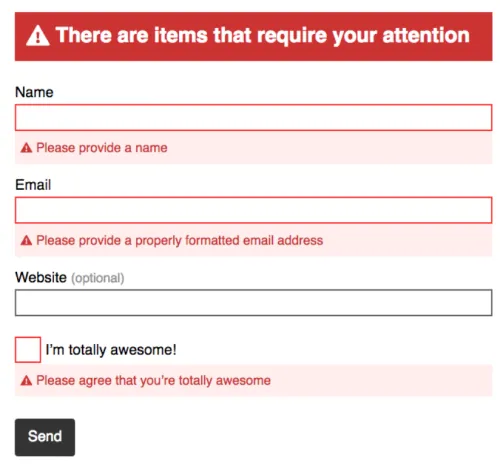
5. Visual Cues: Consider using visual cues like icons or highlighting to draw attention to the error and guide users to the problematic field.
6. Positioning: Place the error message near the associated input field, so users can quickly identify which field requires attention.
Example Email Validation Error Messages
To illustrate the principles mentioned above, let's explore a range of email validation error message examples:
1. Missing "@" Symbol:
- Error Message: "Oops! It seems you forgot the '@' symbol in your email address. Please include it to proceed."
2. Invalid Domain:
- Error Message: "We couldn't find that domain. Please check your email address for typos."
3. Already Registered Email:
- Error Message: "This email address is already registered with us. Please log in or use a different email."
4. Empty Field:
- Error Message: "Please enter your email address to continue."
5. Multiple "@" Symbols:
- Error Message: "It looks like there are too many '@' symbols in your email address. Please remove any extras."
6. Generic Error:
- Error Message: "Invalid email address. Please try again."
7. Password-like Email:
- Error Message: "For your security, please use a valid email address, not a password."
8. Incomplete Domain:
- Error Message: "The domain in your email address is incomplete. Please provide a valid domain."
9. Uncommon Domain Extension:
- Error Message: "This domain extension isn't recognized. Please double-check for typos."
10. Misspelled Domain:
- Error Message: "It seems you may have misspelled the domain in your email address. Please review and correct it."
Best Practices for Crafting Email Validation Error Messages
To master the art of crafting email validation error messages, consider these best practices:
1. Test Thoroughly: Conduct usability testing to ensure that your error messages are clear and effective for your target audience.
2. Consistency: Maintain a consistent error message format and placement across your application to create a seamless user experience.
3. Visual Feedback: Use color, icons, and visual cues to make error messages stand out without being disruptive.
4. User-Friendly Language: Use language that resonates with your users, avoiding jargon or overly technical terms.
5. Accessibility: Ensure that error messages are accessible to all users, including those who rely on screen readers or other assistive technologies.
6. Real-Time Validation: Implement real-time validation to provide instant feedback as users enter their email addresses.
Frequently Asked Questions
1. How can I make error messages more user-friendly?
To make error messages more user-friendly, use plain language, be polite, and provide specific guidance on how to correct the error. Visual cues and positioning near the associated input field also enhance user-friendliness.
2. Is it necessary to provide error messages for email validation?
Yes, error messages are essential for guiding users in correcting their input. Without them, users may become frustrated and abandon the form.
3. What are some common mistakes to avoid when crafting error messages?
Common mistakes to avoid include using technical jargon, providing generic error messages, and failing to offer clear guidance on how to correct the error.
4. How can I ensure that my error messages are effective?
Usability testing and user feedback are crucial for ensuring the effectiveness of your error messages. Pay attention to how users respond to the messages and iterate based on their feedback.
5. Should I use visual cues like color to highlight errors?
Visual cues like color can be effective but should be used judiciously and in compliance with accessibility standards to ensure that all users can understand the message.
In conclusion, crafting exceptional email validation error messages is a vital aspect of enhancing user experience and maintaining data accuracy in your applications. By following the principles and examples outlined in this comprehensive guide, you can ensure that users receive clear, friendly, and actionable error messages that guide them towards accurate data input. Remember that user feedback and usability testing are invaluable tools in refining your error messages for optimal effectiveness.


