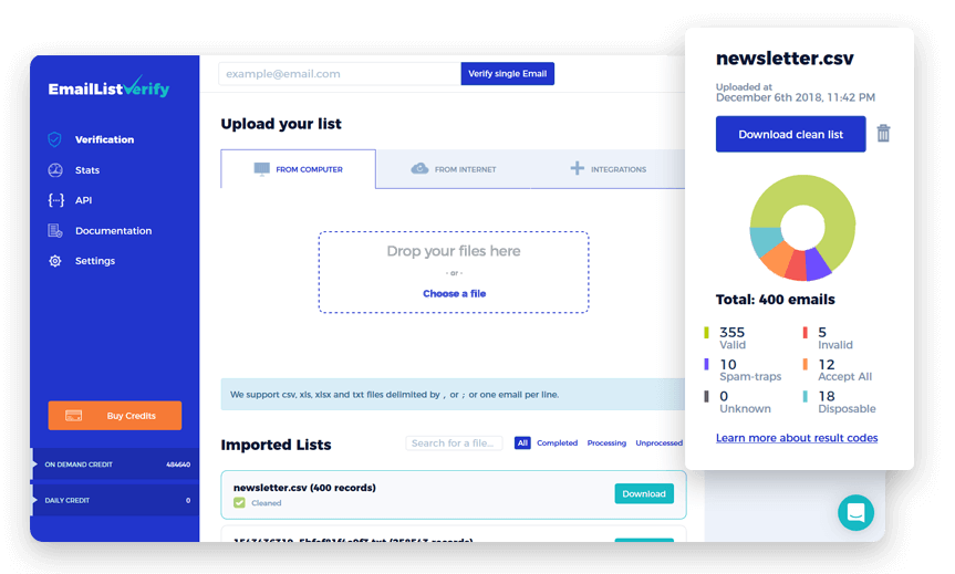
Email verification screens play a crucial role in user registration and authentication processes across digital platforms. They are the gatekeepers that ensure the authenticity of user accounts and protect against fraudulent activities. In this guide, we will delve into the world of email verification screens, exploring their significance, best practices for design, and answering common questions.
The Significance of Email Verification Screens
Email verification screens serve several essential purposes:
Account Security: By confirming the user's ownership of the provided email address, these screens help safeguard accounts against unauthorized access.
Spam Prevention: They deter malicious users from creating multiple fake accounts and sending spam or engaging in other harmful activities.
Enhanced User Experience: Email verification screens ensure that only legitimate users gain access, contributing to a safer and more trustworthy online community.
Design Best Practices for Email Verification Screens
Creating an effective email verification screen requires careful consideration of design and user experience. Here are some best practices to follow:
1. Clear Messaging
Use concise and easy-to-understand language to explain the purpose of the screen. Inform users that they need to verify their email address to continue using the platform.
2. Prominent Call-to-Action
Place the verification button prominently on the screen, making it easy for users to find and click. Use action-oriented text like "Verify Email" to encourage users to proceed.
3. Error Handling
Anticipate potential user errors, such as mistyped email addresses. Provide clear error messages and guidance on how to correct them.
4. Visual Design
Ensure that the screen's design aligns with your platform's overall branding and aesthetics. Use a clean and modern layout, and consider using branding elements such as colors and logos.
5. Mobile Responsiveness
Verify that the screen is fully responsive and functions seamlessly on various devices, including smartphones and tablets.
6. Loading Feedback
Display loading indicators or messages to keep users informed during the verification process, preventing frustration.
7. Accessibility
Ensure that the screen is accessible to all users, including those with disabilities. Use alt text for images and provide keyboard navigation options.
Common Questions About Email Verification Screens
Let's address some common questions related to email verification screens:
Q1: Can I customize the email verification screen on my platform?
- A1: Yes, many platforms allow customization of email verification screens to align with your branding and messaging.
Q2: What happens if a user doesn't verify their email address?
- A2: Typically, unverified users may have limited access to platform features until they complete email verification.
Q3: How secure is email verification as a method of authentication?
- A3: Email verification is a widely accepted and secure method when implemented correctly. However, additional security measures like two-factor authentication (2FA) can provide extra layers of protection.
Conclusion
Email verification screens are vital components of user registration and security on digital platforms. By following design best practices and prioritizing user experience, you can create seamless and secure email verification processes that enhance trust and engagement among your users. Remember that a well-designed email verification screen is not only a security measure but also a reflection of your platform's professionalism and user-friendly approach.


